Wednesday, September 28, 2011

New Freebies!

I had been waiting on this order for awhile and they finally came: my new freebies! These are to replace my business cards – since postcards can be used to send well-wishes to friends and family; instead of my business cards collecting dust or being thrown out.

Since I had gotten such a wonderful response from my “Full Moon” artwork, I thought it would be a good choice to grace the glossy front (and isn’t it just so deliciously glossy!!!). The back – for a wonderful surprise – is a sweet pink and pale-pink candy stripe. It is not coated with the glossiness – so it is very easy to write on.

A postcard is going to be included in every order until I run out (there’s lots, so it will be awhile). And suffice to say, it will be limited edition to the number that I have. Once these run out, I will be creating a new design, and this design will never resurface again.

If you really like them – you can purchase them in sets of 5 here. You will still get the free one as well – so it’s like getting 6 in a set :o)

Tuesday, September 27, 2011

Monday Art Class Cont… : The Kitchen Chair 2b: Complimentary Colours and a Painting Demo

Thank you all for coming back for the last portion of the lesson! Let’s get right to the painting!

And then paint it up. I’ve decided to use the purple-yellow complimentary. I will be painting in acrylic paint. First sketch it out. I’m not too worried about getting the perspective right – I like the feel that a tampered perspective gives, it makes it sort of funky, and puts some emotion into it.

chair01_thumb[2]

Paint in the background:

chair02_thumb[1]

Blocking in the solid of the chair with cadium yellow:

chair03

Adding details:

chair04

And done!

chair05

The Kitchen Chair – 6x8” Acrylic on Canvas Board.

Available here

Can you see what other complimentary pair I snuck in? If you followed this exercise, please do post your link, I would love to see!

Monday, September 26, 2011

Monday Art Class: The Kitchen Chair 2a–Complimentary Colours

For this class we are going to cover complimentary colours, and there will be a painting demo. You are going to need some colours (paint, markers, pastels, ect…), and the sketches that you made last week of your chair, stool – or whatever you had on hand.

First, let’s talk about complimentary colours. We know from our colour-wheel session that red, yellow and blue are primary colours, and orange, green and violet are secondary colours. When we start pairing these up in a specific way, we get complimentary colour pairs.

colorwheel

To make a pair: pick up your colour wheel, and pick any colour. Let’s say, green. Now, look straight across to see what colour is on the other side. You will find that it’s red. Red + Green = complimentary colour (and Christmas, but that’s off topic…).

comp

You will find that when you mix these two colours together you’ll get a muddy brown. A trick to keeping your colours bright when mixing colours: try to stay away from putting complimentary colours together. Then again, if you want to tone down a colour: adding a touch of it’s complimentary will do that perfectly!

Complimentary colours are like a perfect pair – they bring the best out of each other. Used together in a raw form, they may hurt the eyes a little. But if you have a red object that you want to stand out well – using some shade of green in the background will in fact help that red stand out best, according to colour theory.

green

So, according to this theory if Green makes Red pop, then Blue should make Orange pop. And it does. But if you have that red object, and you use blue in it’s immediate surrounding – it may make your red look like there’s a tint of orange in it. So if you want a cooler red (more of a red-purple than a red-orange), you should try to avoid blue in it’s immediate surrounding. It’s hard to illustrate this with scanned paint, as the computer changes the colours..but they look a little different.

blue

Well, that’s a lot to take in…and I’m sorry to say that it’s not even the tip of the ice burg; but I am stopping there. I just wanted you to get an idea of how these things work.

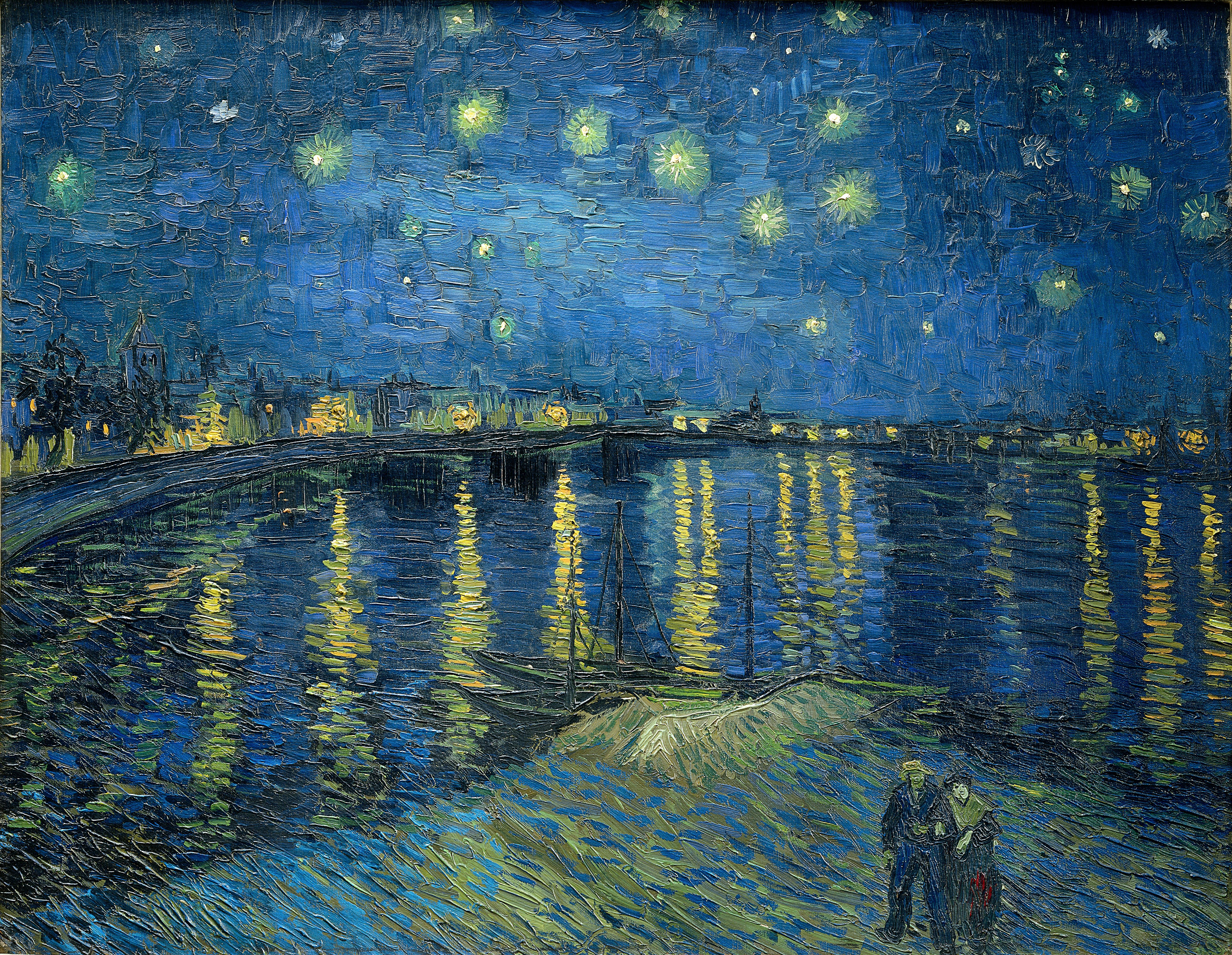
So let’s go back to last week. Looking at the picture I had presented by Van Gogh, you can see that it uses a complimentary pairing in its colours:

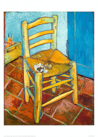
There is definitely an orange-blue combination going on here. This is also a perfect example, where it shows that you can use bright colours to show the pairing – but you don’t need to go to extremes…that’s when your pictures will start hurting your eyes to look at it. Now we’re going to paint / colour a picture based on Van Gogh’s painting.

Take a look at your sketches from last week, and pick the one that you like most. I’m going to pick the one at the top left.

Tomorrow I will show you my chair. This way, it gives you time and space to interpret things in your own perspective, and have your own take on it without influence :o) And, since I was working the weekend, I didn’t have enough time to completely finish mine in between cleaning, packing orders and answering emails.*blushes* Happy Painting / Drawing / Colouring!

Saturday, September 24, 2011

Doodling Heaven

I recently received an order in the mail, and what did I find in the box as well: a crazy long piece of Kraft paper. Of course, I am going to recycle it.

But, first I thought that I might doodle on it for a little bit…why not? How often are you presented with the opportunity to doodle on such a large piece of paper without pressure or drawing something ‘worthy of attention"’…you know what I mean, you always save your more careful drawings / paintings for your better quality papers.

Here is a peak at some of the doodling that I had completed before it got too dark to take decent pictures:

I was playing with some various coloured conté and some charcoal. It was lots of fun and very relaxing to just sprawl on the floor and let loose with the drawing materials.

Wednesday, September 21, 2011

My Creative Space: Getting Folk-sy

Upon getting some new painting brushes (two Princeton Neptune brushes, and two Princeton Snap! brushes, which I absolutely love by the way, and will be getting one of these two brands again for sure), I wanted to great a ‘fun’ painting. With Halloween around the corner, I thought why not:

So that is where the painting stands now. It was a lot of fun getting to this point. The costumes that the four children are wearing, are costumes that my brothers and I have worn when we were young that my mom made for us: a lion, a cowboy (thanks to lots of dads old cowboy stuff), a princess and a dragon / dino. There are a lot of pumpkins by the house, and a trick-or-treating ghost on the lawn that are masked out.

I’ve sort of hit a ‘block’ with it though. I want to add some more scary things, but I’m not sure what. And I’m not 100% sure what I’m doing with the house, that’s why so much of it is left unpainted. A bunch more shadows…who knows.

You can see more creative spaces here.

Tuesday, September 20, 2011

The 2012 Sketchbook Project: A Love Like Sunflowers.

Last week was my 25th birthday, and James got me a gorgeous bouquet of flowers. They were so lovely, especially the sunflowers – which he knows that I love!

sunflowers_large copyA Love Like Sunflowers – ink and watercolour, sketchbook project 2012

So, I thought that I would create a spread in my sketchbook for the sketchbook project with a sketch of them.

James also gifts me a KOBO – which I have been reading on almost non-stop since! It’s perfect for me, since I often bring books to read during breaks / lunch at work and now I don’t have to lug them around, and I can flip between books if I want very easily. All my wonderful friends gave me quite the jump at a surprise dinner as well. I love them all so much! It was a very wonderful and special birthday.

Monday, September 19, 2011

Monday Art Class: The Kitchen Chair– Part One

This Monday, we are going to get a little messy. Grab some charcoal, some newsprint paper (or your sketchbook, but you can get pads of newsprint for dirt cheap), and your kitchen chair, stool, bench – whatever you sit on. I choose this subject, since most people will have some sort of chair at their disposal.

This exercise was inspired by one of Vincent Van Gogh’s chairs:


You are going to draw the chair you have chosen in many ways. You’re not going to be super detailed about it…this exercise is just to loosen your hand up a little bit and warm you up.

So place the chair in front of you and draw it as you see it. Use the charcoal very lightly to get outlines, and apply it more darkly as you zone into detail. When you are done, move the chair and draw it again. Move it again, draw again. Keep doing this until your page is filled up (or if you have a small page, until many pages are filled up).

It is a good idea to have the chair is some ‘not-so-usual’ angles as well – it makes you let go of the fact that it is a chair, and forces you to focus on the shape elements of it.

Here is my page of chairs:


Keep this page for next week. We are going to continue to use the chair in another exercise, and these drawings will help you choose how you wish to approach it.

Saturday, September 17, 2011

The Sketchbook Project 2012: Love Songs

I finished another spread of my Sketchbook Project. I do believe that I am half way done now, or at least very close.


sketchbook


This spread features lyrics by Paramore and and Ingrid Michaelson. It was done in ink and watercolour using masking fluids and cling wrap.


I’ve also started working on the cover, having finally decided on an idea – but it will take a little while to complete. It’s just in it’s preliminary sketch-phase right now.


Here is a sneak-peek at another spread that I’m working on in ink. It uses the other side of the tissue paper from another spread in the book.


sketckbook01

Thursday, September 15, 2011

25!

Today I turn 25! I really cannot believe it…

25

I celebrated with my family on Tuesday, and today James will come up and we will have dinner and a chill night.

On Tuesday, I checked my last “Under 25” box on a contest ballet at the Outdoor Farm Show (huge farm show in Woodstock, Ontario that my parents wanted to go to, and I tagged along to hang out with my parents and brothers…turned out to have a lot of interesting stuff, and some pretty cute puppies). It made me sad that now I am in the 25-30 category, or whatever range it is….

Monday, September 12, 2011

Monday Class: Inspiration - Van Gogh

Van Gogh was a Dutch post-impressionist painter. I have always adored his paintings largely due to the amazing texture, vivid colours and flowing movement that is portrayed in many of his later pieces. He is said to have only begun painting at the age of 28 - a great inspiration to those who have just started painting: it’s never to late to pick up a brush and go.

Some of my favourites:


Starry Night Over The Rhone


Irises

You can find tons of information about this wonderful painter, as well as early works and sketches at: http://www.vangoghgallery.com/

Here is a charcoal sketch that I did based on his work - his bold strokes and scrolling skies:


Homework: Create a composition inspired by one of Van Gogh’s pieces, or recreate one of his pieces (the master's all learnt through imitation of their peers). Please post and share!

Thursday, September 8, 2011

My Creative Space

This week was mostly ‘administrative’ stuff that I was busy with – keeping caught up with tax stuff, filing various odds and ends, website administration - but I did manage to get in some painting time.

First off, I finished my waterfalls painting. This was the only picture that I’ve been able to take of it, and the lighting wasn’t so great. I will need to take a better picture before I post it.

falls_small

I’ve been working on some more Christmas cards for my shop. Some of them sold, so I want to keep some stocked and available.

I’ve also been working steadily on my sketchbook project. Here are two pages that are in progress. I’m just waiting for them to dry so that I may continue.

I have another painting from the studio to share. I used crackle paint on this one in the pastures and got some interesting texture effects with it. I have to take more pictures, as with waterfalls – I’m just waiting for a day with some good lighting.

pastures02_small

You can find more creative places here.

Monday, September 5, 2011

Monday Art Class: String Gel

So my first class last week was somewhat 'serious'...a little bit of thinking, and no obviously art piece came out of it. This week I thought we would play with a truly fun art medium: String Gel (by Liquitex)... (also called 'Tar Gel' by Golden). I use both in this demonstration.

It is a clear acrylic medium, which has a consistency very similar to honey. That makes it very messy – as it will dribble all over the place while you try to take some out. You can add colour to it, or just use it clear to add lots of texture.

But, before we play. There are some rules:

  1. Do not 'agitate' the gel very much - ie. do not stir or shake it before using. If you do it will a) get a whole bunch of air bubbles in it (unless that's what you want), and b) it will loose some of it's stringy consistency. I will note here, that I don't *always* find this if I mix carefully, but it's the golden rule that is everywhere, so it is noteworthy.
  2. If you choose to add colour, you only need to add a teeny, tiny amount - like a drop. Fluid acrylics are best to add, but any acrylic will work. Slowly mix in the colour, and then let it sit so that #1 does not happen. This medium takes paint wonderfully, and completely stretches your paint.
  3. This gel is self-levelling, so you would like your layers of string to build up on top of each other, then you need to let each layer dry. It is quick-drying, so you don't have to wait long. You also don't have to wait for it to be completely dry - once it has a ‘dry film’ on the layer, it should be okay.
  4. Not really a rule, but good piece of knowledge: I found that Golden’s Tar Gel would give me thinner strings than Liquitex’s String Gel – so purchase based on what you’d like to achieve.

Okay, with that out of the way - let's play!!

Let’s first add a teeny amount of colour to a portion of the medium that I have placed into a separate container. I found that mixing on a palate does not work well, especially if you are letting it sit to get out all the air bubbles from mixing.

Mixing it slowly into the medium until it is a solid colour. The colour you see is the colour that it will dry to.

I found that a palette knife, with a narrow tip, works before for dipping into the medium and drizzling over my support. Some people put it into bottles and pour it out, others use the ends of brushes, or whatever they can get their hands on.

string_gel

This picture is blurry b/c I was moving with the palette knife so quickly to keep my drizzle thin. You can drizzle more slowly and get a thicker one. As you can see, I have air bubbles – I am not the most patient person, and once I started working on this piece, I just got so into it.

I drew my inspiration for this play from some abstract pieces that I have found online that I thought were interesting.

Jackson Pollock - No.9 - a huge contributor to abstract expressionism, this artist created his piece on a huge scale...mine will be a bit smaller. He splattered the paint around, and considering 'String Gel' is a fairly new medium, I don't think he had it at his disposal.

And here is my completed work:

whereisthelove

Where Is The Love? - 9x12" acrylic on masonite board

I might be adding some more layers to it…not 100% sure that it feels finished. But I still wanted to share with you where I was with it.

If you can get your hands on this stuff it's definitely worth a try...not sure if you'll finish using the bottle? I used some of it for a very shiny, almost 'hard candy' sort of clear coat on a recent painting of mine. It does take a bit of experimentation to get a feel for it.

Saturday, September 3, 2011

Family Genes

It’s quite obvious that there’s something in my families genes that have contributed to my being an artist. I’ve been creative ever since I could – Christmas gifts were often craft sets of all sorts, and then one year I got my first acrylic painting set from my grandparents. It was pretty cool looking: had Chinese lettering on the tubes – they had gotten them in British Columbia while visiting my aunt. They were pretty special to me, and I tried to use only teeny amounts and make them last as long as I could.

Anyways, almost everyone on my Mom’s side of the family is artistic in their own way. My mom has always dabbled in drawing and painting – she would doodle horses and deer while talking on the phone: with all the musculature….yes, doodling. My Aunt Connie is a wonderful painter who lives out west, you can see her art on her website.

Next would be my cousin Becky, she creates wonderful mirrors by piecing smaller elements together. She runs a store online called CatchaGlipseMirrors through Etsy. My favourite would have to be her Octopus mirror:

My Aunt Jane paints, and has an Etsy store called Waterlilys. There she offers adorable watercolour paintings and fine art paintings. Her My Treasure painting is perfect for the upcoming fall season:

Friday, September 2, 2011

Birthday Cards

It was my good friend’s birthday the other day, and since she’s artsy like myself I knew that a hand painted card was in order:

I added sparkles, since I personally think every birthday card should have some sparkle – it just makes it so much fun!

Happy Birthday Girlie!!!